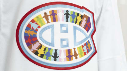
To come up with a concept for her design, Amelie made a list of values that reminded her of the 2SLGBTQIA+ community, as well as keywords associated with the world of hockey, until common themes that could tie the two together emerged. The idea to draw a row of characters all united and holding hands to form the logo of the Canadiens emerged.
"I thought it was a strong image that represented several aspects that are at the heart of the 2SLGBTQIA+ community, beginning with this sense of community, but also diversity, plurality and intersectionality."
For Amelie, the concept of intersectionality refers to the notion that "an individual can be more than just one single thing". The intersectional approach helps recognize that certain marginalized groups within the 2SLGBTQIA+ community - such as racialized, socioeconomically disadvantaged or disabled people - experience different forms of discrimination, and that the gains and rights of some are not shared equally by all.
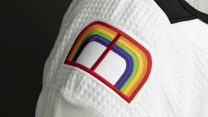
Amelie drew inspiration from the Progress Pride Flag, a more inclusive and progressive iteration of the flag redesigned in 2018 by Daniel Quasar, to design the jersey's color palette. Black and brown chevrons to include people of color, as well as white, pink and light blue lines to represent trans people, were added to the traditional rainbow in this new version which now includes 11 colors.
Featuring them all in her design played to the spirit of inclusivity. "If you look closely at the illustration, you'll notice that each character is unique, and that they're also all different colors. My goal with the characters was to make them as gender neutral as possible so that anyone could identify with at least one of them. It was important to me that everyone felt represented."
