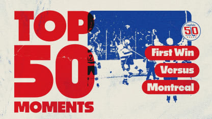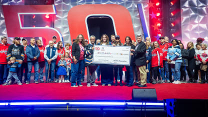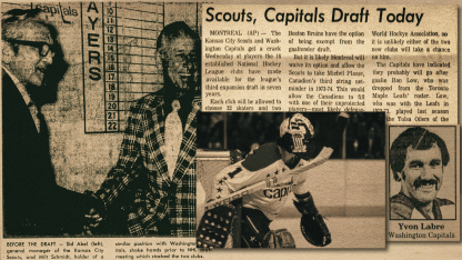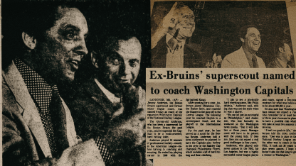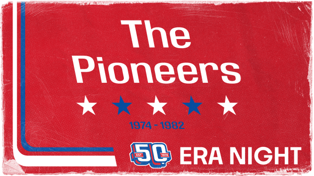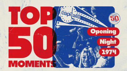
Capitals Top 50 Moments | Opening Night 1974
A look back at Opening Night in 1974


November 8th vs. Pittsburgh Penguins
Come celebrate the first era of Capitals hockey and get ready to go retro, as all fans in attendance will receive an original Capitals replica jersey!
December 14th vs. Buffalo Sabres
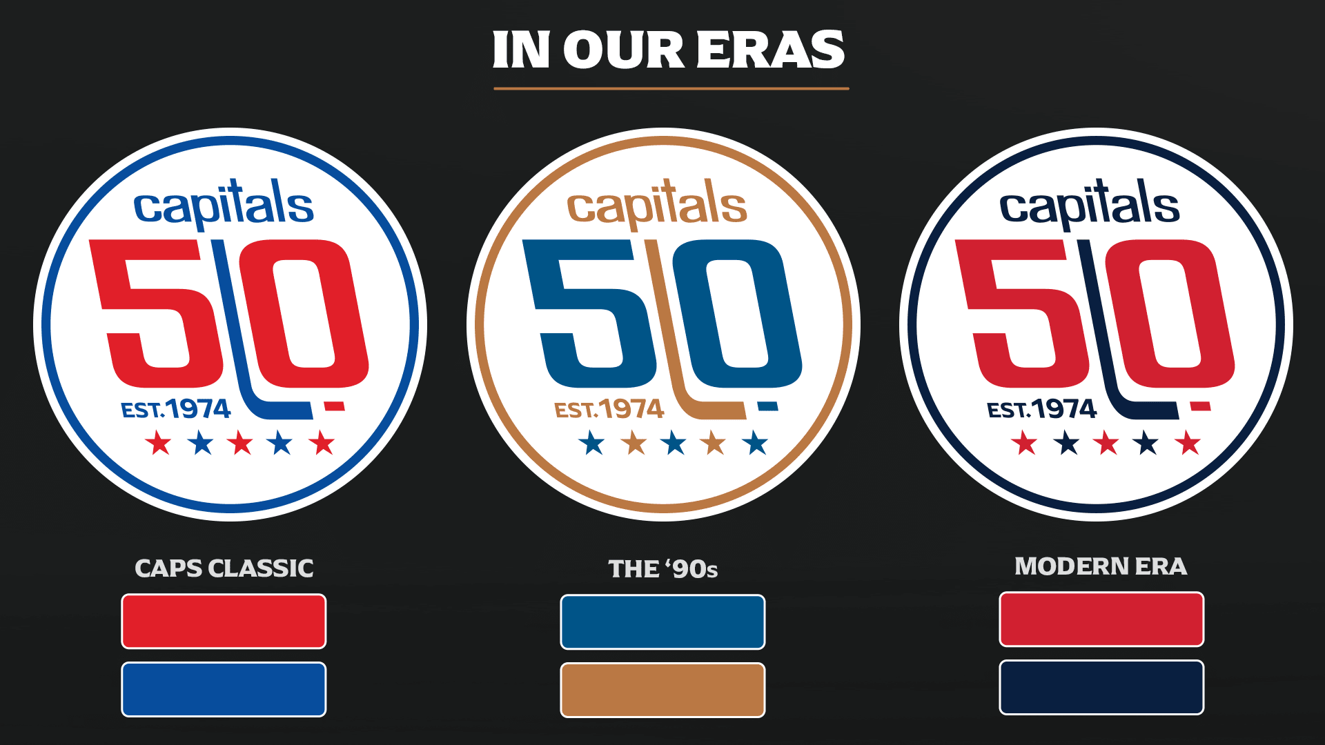
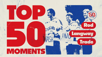
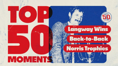
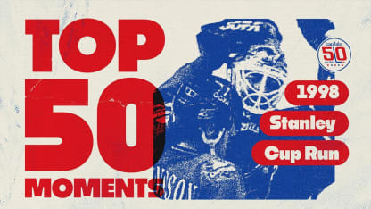
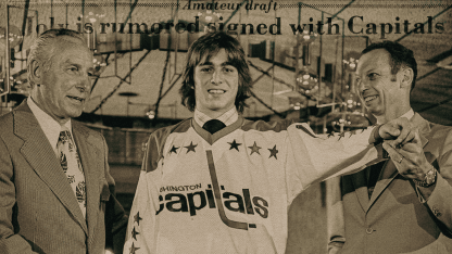
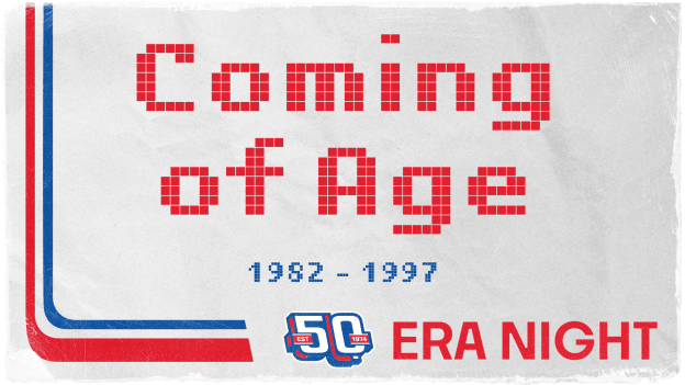
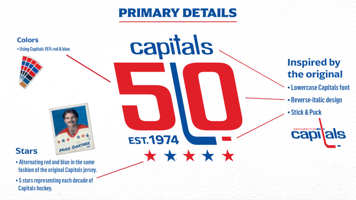
The Capitals take another look back into history, as we celebrate the Caps’ accomplishments and biggest moments between 1982 and 1997 on our second Eras night. All fans in attendance will receive a Mike Gartner and Rod Langway duo bobblehead.
February 1st vs. Winnipeg Jets
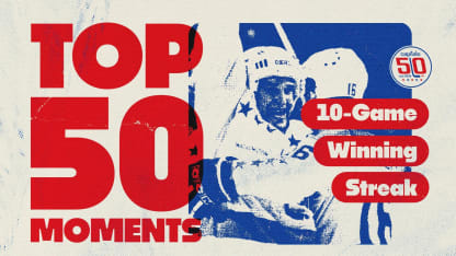
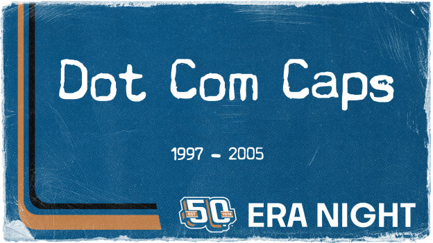
In our third Eras night, we turn back the clock to recognize the third era of the Capitals’ history when they play the Jets. All fans in attendance will receive a Peter Bondra and Olie Kolzig duo bobblehead.
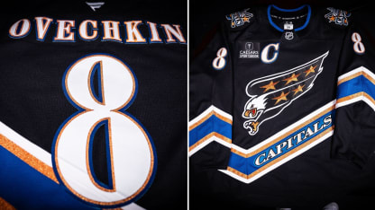
March 7th vs. Detroit Red Wings
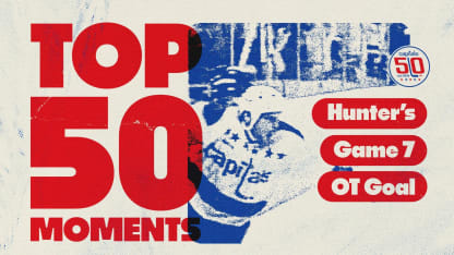
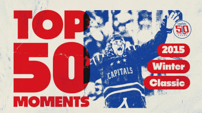
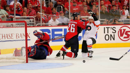
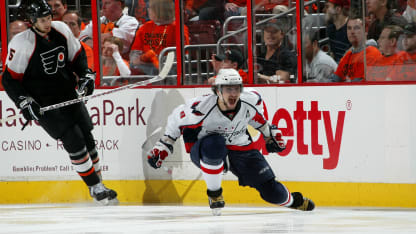
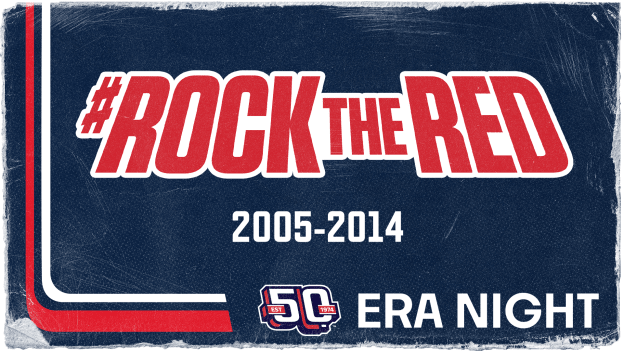
Take a trip down memory lane, as the fourth Eras night celebrates the Caps during the Rock the Red era. Join us to celebrate and go home with an Alex Ovechkin and Nicklas Backstrom duo bobblehead!
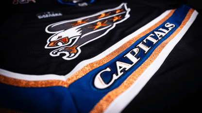
April 4th vs. Chicago Blackhawks
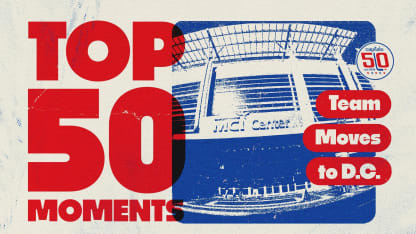
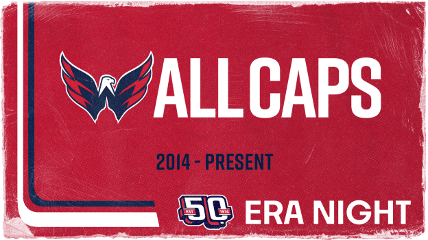
Back to the future! Join the Caps in celebrating the most recent era of hockey history, including our Stanley Cup Championship and present day. All fans in will receive a Capitals 50th Anniversary photo book!