Beginning of dialog window. Escape will cancel and close the window.
End of dialog window.
This is a modal window. This modal can be closed by pressing the Escape key or activating the close button.
That’s right. We’re going back to our roots.
Next season and beyond, we’ll see something mighty familiar on the ice—but it's not quite the same. It’s a bold modernization of a legendary icon. A tribute to our legacy, with an eye on the future. And this evolution is the start of a revolution.
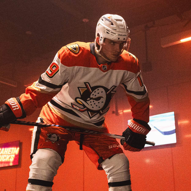
You’re entering Orange Country.
Video Player is loading.
Current Time 0:00
/
Duration 0:00
Loaded: 0%
Stream Type LIVE
Remaining Time -0:00
1x
Chapters
descriptions off, selected
captions settings, opens captions settings dialog
captions off, selected
This is a modal window.
Beginning of dialog window. Escape will cancel and close the window.
End of dialog window.
This is a modal window. This modal can be closed by pressing the Escape key or activating the close button.
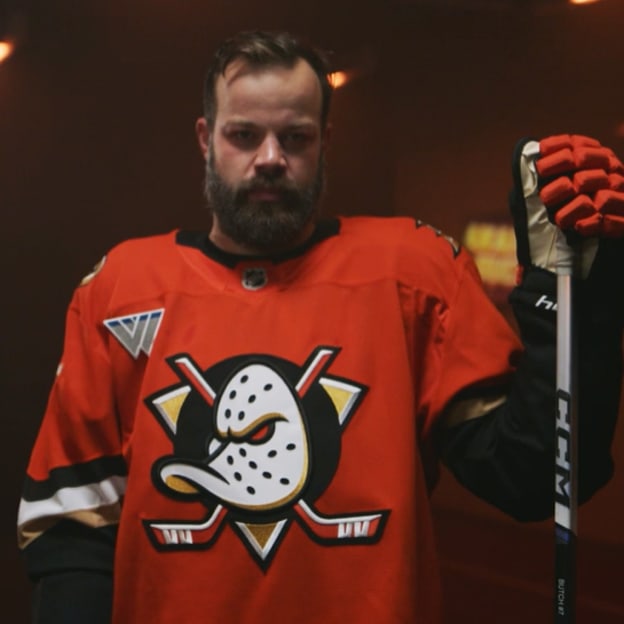
Orange is the Anaheim Ducks. It’s the embodiment of the place we call home, a bold color we wear with pride.
Classic black and white give sharp contrast. Elegant gold accents complete our look—after all, what would Orange County be without its golden, sandy beaches?
Look closely and you’ll see details crafted with intent, seamlessly blending tradition and modernism, simplicity and significance.
It's All in the Details
Sharper angles and a striking presence are a beacon of our ambition. Our logo's determined expression is a striking embodiment of our evolution, while Wild Wing's "WW" remains a foundation of the stick blades. Our former primary mark has also been refined and takes its place as our secondary logo.
One Nation, United in Orange
Every stitch and hue embody our philosophy, and our motto is kept close to our hearts. Meticulous attention to even the smallest details makes each distinctive element build together to create a powerful identity.
Fly Together into a New Era
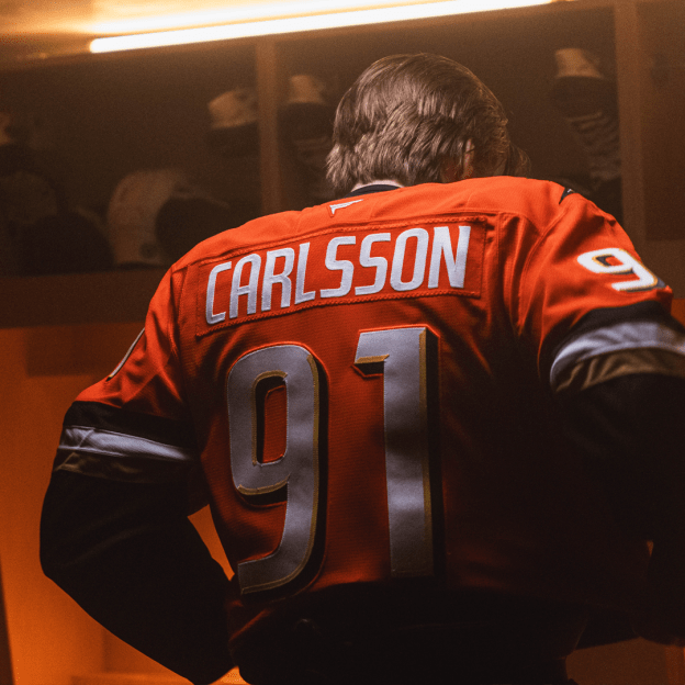
From a sleek new typeface to a streamlined representation of our past on each shoulder, our new identity at home and on the road is a fusion of our heritage, our spirit, and our vision.
We’re proud to be Orange County’s team. It’s a place where the weather is always warm and sunny, but our fans are anything but fair-weather.
Let’s Fly Together into this new era. Stand proud, Orange Country—this is your team.