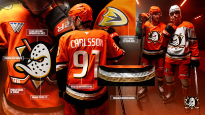
A dynamic, aggressive orange eye in the Duck mask with a fearless expression symbolizes the evolving primary mark, a revolution to be faster, more exciting and more aggressive than ever before, both on and off the ice. The eyebrow has a more rounded, aggressive curve, marking an on-ice tenacity the team has developed over its three decades of existence and reflective of the miles of powerful Pacific Ocean rock reef and beach-break waves that crash up and down the coast.
Elegant gold accents complete the look within the logo, adorning a shimmer effect to give a glimmer of Orange County’s iconic beaches.
This emblem is not just a new image; it is the embodiment of the team’s evolution. It draws from the colors of our Orange County sunsets, the art deco lines of our city's architecture, and the rich history of our citrus-filled heritage. It holds within it the mischievous spirit and bravery that characterizes the Ducks. Look closely and you'll see the fine balance between tradition and modernity, simplicity and significance. The logo is designed to stand out.
THE NEW JERSEYS
The evolution of a refreshed look will mark the fourth set of primary jerseys since the Ducks’ inception in 1993, following the inaugural Mighty Ducks jerseys (1993-2006), a new era as the Anaheim Ducks with a typographic mark (2006-14) and the most recent iteration of the integration of the stylized “D” that echoed the image of a duck’s foot (2014-24).
A return to the pinnacle of ‘90s hockey fashion, a new, powerful identity at home and on the road are not just apparel; they are an emblem of the team’s identity, embracing unexpected aggression that defines a path forward. Intended to align the club’s history, ambition and vision, a simplified design with sharper angles, clean lines and sharp contrasts were inspired by the vibrant culture, colors and energy of Orange County, elevating orange for a bold impactful look present throughout the uniforms, including the pants, helmet, socks and gloves.
Both jerseys incorporate a bold new typeface and number palette modeled after Orange County’s turn of the century art deco styling commonly used in the citrus industry at that time, when Orange County truly took hold and began to really foster its own identity. A modernized number typography includes shading elements of orange, black, gold and white.
The former primary mark has also been refined and takes its place as our secondary logo, emboldened as a shoulder patch. Also include in the jersey design on the interior hemline reveals “Ducks Hockey” to embody the club’s philosophy.
Anaheim’s primary home jersey blends the past with the present, a cohesive design both modern and timeless. Anchored at the center of the bold jersey lies the refreshed iconic mask framed by a bold orange base. Accented by horizontal waist stripes and chevron shapes on the sleeves is a contrast of black, white and gold stripes transitioning into a black sleeve cuff.


