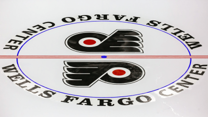
For many years, two NHL teams featured dual logos on either side of the red line at center ice: the Philadelphia Flyers at the Spectrum and the Wells Fargo Center and the Montreal Canadiens at the Forum and Bell Centre. Most teams had one large logo that covered most of the center ice faceoff circle.
Flyers co-founder and longtime chairman Ed Snider strongly preferred the double-logo look. The reason: He did not like how a large single logo, by necessity, was bisected by the red line. Conversely, having two symmetrical smaller logos on either side of the red line kept the logos fully intact without being "split up". Mr. Snider passed away on April 11, 2016, at age 83.
Shortly before the start of the 2018-19 NHL season, the Canadiens replaced their double-logo design at the Bell Centre with a single logo. That briefly left the Flyers as the only NHL franchise with double logos. The next season, the Flyers went to one center-ice logo at the Wells Fargo Center. The single-logo design remained through the 2022-23 campaign.
This year, as part of the "New Era of Orange" campaign -- which pays homage to distinctive Flyers traditions while embracing an ongoing rebuild and overhaul in management and hockey operations -- President of Hockey Operations Keith Jones felt the time was right to make a return to the double-logo at center ice.
Restoring "fully intact" logos to the ice surface is a relatively minor, cosmetic gesture. However, it's a symbolic change to restore a small piece of Flyers tradition that set the club apart from other organizations. It's also a homage to Mr. Snider, who certainly would have approved of the double logos' return.
Center Ice Double Logo is a Return to Tradition
The Flyers will return to the double logo at center ice ahead of the 2023-24 season.


