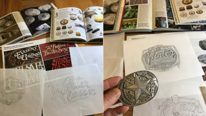
The NHL and Fanbrandz, a sports branding agency in Montclair, New Jersey, started by looking at the history of Winter Classic logos. A consistent thread has been a script "Winter" and a bold "Classic" in the foreground.
"When you see them all side by side, they look like they all come from the same visual voice," Conway said. "They certainly evolve over time. They have a consistent look, which has been achieved through the Winter Classic typography. They take on an evolution, if you will, inspired by the location that we end up in."
In 2016 in Foxboro, Massachusetts, the logo looked like an old New England sign. In 2017 in St. Louis, the right part of the "W" in "Winter" soared into the left side of the Arch. In 2018 in New York, the dominant image was an "X," the Roman numeral representing the 10th Winter Classic, topped by the Empire State Building and the Statue of Liberty. In 2019 at Notre Dame, the logo was a simple green shamrock.
OK. Dallas. Big D. Everything's bigger in Texas. What represents that identity? What creates a sense of place?
The NHL and Fanbrandz pulled logos and images to study for inspiration, everything from neon roadhouse signs to Cotton Bowl programs to western movie posters, while keeping this in mind: The NHL held the 2016 NHL All-Star Game in Nashville, and the logo was shaped like a guitar pick. This event will feature the Predators and country music, but it can't sound like the same old song.
"The biggest issue here was to be different than Nashville, but yet understand exactly where we're at and be unique to Texas," Mayer said.
The NHL and Fanbrandz latched onto belt buckles and Texas Rangers badges, which combine bold, instantly recognizable symbols with fine, hand-carved details. They studied silversmithing, color accents and western lettering. From pencil sketches to computer concepts, they tweaked and tweaked again.
"Some of the early iterations were feeling a little flat," Conway said. "How do we push that metallic feel and get that metallic texture in there?"
Said Mayer: "When we animate this, it will really feel three dimensional and like a belt buckle. But when it's flat, how do you make it look like it's not?"
They found a way. Let's just say it's not their first rodeo.
"For us," Mayer said, "this is another notch on the belt."
The next step will be to peel off parts of the logo, make them their own assets and develop an identity system -- in other words, to use them to create secondary logos and design motifs that feel connected.
"It's the subtle design," Mayer said. "You've got to look behind the logo, underneath the logo and see the craftsmanship, as if they were sculptors or jewelry designers. … It's not only what's in your face, the wordmark that's on there, it's what's in the background that then becomes part of everything we do."

