With the NHL season having been paused on March 12 due to concerns surrounding the coronavirus, Kevin Weekes will continue his Friday Four. The NHL Network analyst and former goalie will be blogging about four of his favorite or memorable items on a certain topic. Today, his four choices for the best NHL jerseys of all time.
Friday Four: Blackhawks, Sharks among best jerseys of all time
NHL Network's Weekes also favors Rangers, Gretzky-era Kings sweaters
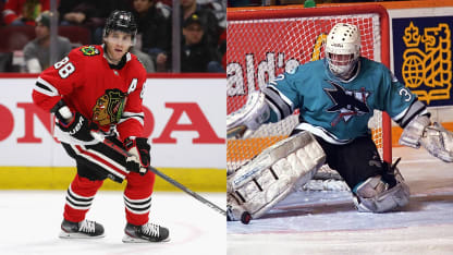
© Getty Images
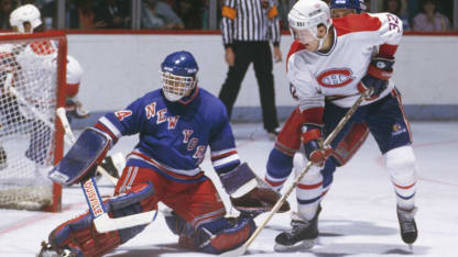
© Denis Brodeur/Getty Images
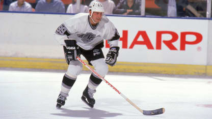
© Mike Powell/Getty Images