logos_NHL100-frame

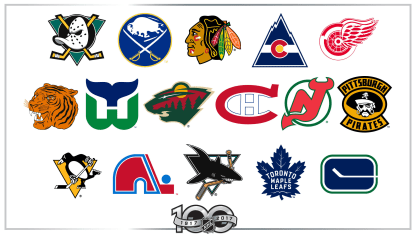
Gracing the front of just about every NHL sweater ever worn, logos have played an underappreciated but very important role in hockey history. They can be an instant visual link between eras; players and coaches come and go, but a logo can last for generations.
Here we take a look at what I consider to be the greatest and most iconic logos to be worn throughout the NHL's first 100 years.

Hartford Whalers

Logo from 1979-80 to 1991-92
The Whalers may be gone, but they will never be forgotten. Adapted for the Whalers' move to the NHL in 1979 from the World Hockey Association, the classic green-and-blue logo features a W with the tail of a whale on the top. While that alone would make for a great design, the H for Hartford, formed by the negative space between the W and the tail, puts this one over the top. Hartford used this logo until 1992, then modernized it and added silver for the 1992-93 season. The logo was retired following 1996-97, when the Whalers became the Carolina Hurricanes.

Minnesota Wild

2000-01 to present; last refined in 2013-14 (logo shown from 2013-14 to present)
The return of the NHL to Minnesota for the 2000-01 season (the Minnesota North Stars left and became the Dallas Stars for 1993-94) brought with it a new name and an interesting new logo. Depending on how you look at it, the Wild logo is either a look outside a forest in Minnesota featuring a row of pine trees with a winding river, a shooting star, and a sun setting against a red sky, or it's a profile of the head of an animal (some say it's a bear, but it's actually meant to be a generic wild animal) with an eye and its mouth, nose, and ear all shown. The logo debuted with "Minnesota Wild" in arched lettering overhead; the name was removed for 2013-14.

Toronto Maple Leafs

1938-39 to 1966-67, 2016-17 to present; last refined in 2016-17 (logo shown from 2016-17 to present)
The iconic blue-and-white logo has taken many shapes since being introduced in 1927. The logo had become more simplified over the years before the most recent version. Adopted in 2016, it has much more detail, closely resembling the crest used until 1966-67. The 31 points of the leaf represent 1931, the year Maple Leaf Gardens, the Maple Leafs' home until 1999, opened. The 13 veins within the leaf stand for Toronto's number of Stanley Cup championships.

Detroit Red Wings

1932-33 to present; last refined in 1948-49 (logo shown from 1932-33 to 1947-48)
This logo is synonymous with the Red Wings, but its origins can actually be traced to Montreal. The Montreal Amateur Athletic Association had a logo featuring a wheel with wings when it became the first Stanley Cup Champion in 1892. When James Norris, a former member of that team, purchased the Detroit Falcons in 1932, he changed their name to the Red Wings and made the "Winged Wheel" their symbol, thinking it'd be perfect for the Motor City. It has remained the Red Wings' logo to this day, with only the size of the wheel changing; it became smaller in 1948.

Chicago Blackhawks

1959-60 to present; last refined in 1999-2000 (logo shown from 1999-00 to present)
The original Blackhawks logo was designed in 1926 by former ballroom dancer Irene Castle, the wife of owner Frederic McLaughlin. It had a simple black-and-white circle with the team's name (then the Black Hawks) surrounding it and featured the profile of a Native American, similar to Chicago's current logo. Like most Original Six logos, it has been tweaked over the years. In 1955-56, the Blackhawks finally dropped the circle on their uniforms and a version more closely resembling the modern logo made its first appearance on the jersey for 1959-60.

Hamilton Tigers

Logo from 1920-21
Hamilton had three logos in its five NHL seasons. The first was this highly detailed depiction of a tiger's head. Placed on the front of a jersey that also featured vertical black and orange stripes, the logo stood out compared to those of other teams in 1921, when logos were typically extremely basic. Unfortunately the logo was used for just the one season, likely due to the amount of work required to produce these patches; they had to be made by hand, one at a time.

Pittsburgh Penguins

1972-73 to 1991-92, 2002-03 to present; last refined in 2016-17 (logo shown from 2016-17 to present)
The skating penguin first appeared within a black circle featuring the Penguins' name. Debuting in time for the Penguins' second season, 1968-69, the cartoon bird was worn with powder blue jerseys until a switch to black and gold midway through the 1979-80 season to coincide with Pittsburgh's two other pro sports teams, the Pirates (MLB) and Steelers (NFL), who each had just won a championship. The Penguins won championships of their own with this logo, in 1991 and '92, before it was changed for 1992-93. It proved too popular to remain retired, and the Penguins brought it back as an alternate with muted colors in 2000 and as a full-time logo for 2002-03. They have won three more titles since the switch back (2009, 2016, 2017). For 2016-17, the original shade of Pittsburgh gold returned. The triangle behind the penguin represents Downtown Pittsburgh, nicknamed the "Golden Triangle."

Colorado Rockies

Logo from 1976-77 to 1981-82
No, not those Colorado Rockies of MLB -- these are the originals. In 1976, the Kansas City Scouts moved to Denver after two seasons in Missouri, taking on a new name and logo. The Scouts' colors -- red, blue and yellow - were also on the Colorado state flag and thus retained. The Rockies' logo resembled the state flag but in the shape of a mountain. It was the only logo the Rockies used before becoming the New Jersey Devils in 1982. In 2015-16, the Colorado Avalanche adopted the Rockies' logo -- modernized and with maroon, silver and blue -- for their alternate jersey.

Montreal Canadiens

1917-18 to present; last refined in 1999-2000 (logo shown from 1917-18 to 1918-19)
Sure, it may just be a simple C and an H, but this logo has been involved in far too many historic NHL moments to be ignored. The Canadiens first wore a logo featuring the wide C on their chests in 1913, four years before the establishment of the NHL. At the time, the C had an A inside that stood for "athletic." The Canadiens swapped the A for an H (representing "hockey," not "Habs," a common misconception) in 1917, and several tweaks to the logo followed over the rest of the 20th century. The most recent shape of the crest was introduced in 1956, and the color shades were darkened in 1999.

Buffalo Sabres

1970-71 to 1995-96; 2010-11 to present; last refined in 2010-11 (logo shown from 1970-71 to 1995-96)
This logo says it all without saying a thing. Literally. Set upon a blue circle with a gold outline, the Sabres logo debuted for their inaugural season in 1970. The design features (are you ready?) a buffalo leaping between two crossed sabres. Buffalo. Sabres. Brilliant. The logo lasted more 25 years before a rebranding in 1997 completely changed the logo and colors. Fans made it known rather quickly that they missed the old look, and it was finally brought back full time (with darker colors and extra silver lines) in 2010.

Quebec Nordiques

Logo from 1979-80 to 1994-95
Like with their provincial rivals in Montreal, the logo of the Quebec Nordiques predated their entry into the NHL. First introduced for the inaugural WHA season in 1972, the logo has a lowercase N in red with a hockey stick and a puck off to its side, forming the shape of an igloo when viewed altogether. The Nordiques brought the logo to the NHL in 1979 and used it right up until their final game (they became the Colorado Avalanche for 1995-96). Quebec had planned a logo change for 1995-96 featuring a wolf head on a triangle, but due to the move to Colorado it was never used during a game.

Pittsburgh Pirates

Logo from 1929-30
More than 40 years before the Penguins joined the League in 1967, Pittsburgh had an NHL team. As was fairly common for the period, it took the name of another sports team in town -- the Pirates of MLB, in this case -- but long before the baseball team adopted the black and gold, the NHL's Pirates used that color scheme right from their first season, 1925-26. For the 1929-30 season, the Pirates used this logo featuring the head of a pirate, complete with hat, earrings, bandana and, of course, eye patch. As with most detailed logos of the time, it didn't last long; the Pirates moved the following season, becoming the Philadelphia Quakers, and the logo was never used again.

Mighty Ducks of Anaheim

Logo from 1993-94 to 2005-06
I was never a fan of the logo used by the Mighty Ducks of Anaheim upon their founding, but I cannot deny how popular it was then and how even more popular it is today. The team named after a movie wore this logo -- a goalie mask in the shape of a duck's head on a black circle, two crossed sticks and a jade triangle -- from its first season in 1993-94 through 2005-06. It was replaced in 2006-07, when the renamed Anaheim Ducks, with a new logo and colors, won the Stanley Cup. The Ducks have recently brought this logo back on an alternate jersey in bronze and black.

New Jersey Devils

Logo from 1982-83 to 1991-92
When the Colorado Rockies moved east in 1982, they changed everything. The result was the New Jersey Devils, named after the legend of the "Jersey Devil," a mysterious beast reported to be seen around the state for years. The logo is an N and J mashed together to form a single letter with devil horns at the top of the N and a pointed tail at the end of the J. The original colors, red and green, were chosen because New Jersey is nicknamed the "Garden State" (black replaced green for 1992-93).

San Jose Sharks

1991-92 to 2006-07; refined in 1998-99 (logo shown from 1991-92 to 1997-98)
The original Sharks logo turned the hockey merchandise world on its head when it was introduced for San Jose's inaugural NHL season, 1991-92. Not only was the logo itself not like anything the League had seen, but the color scheme of teal and silver was a welcome departure from the blues and reds typically worn throughout the NHL. San Jose's logo featured a shark chomping down on a hockey stick, all within a triangle, with the three points representing the Bay Area's three major cities: San Jose, San Francisco and Oakland. The Sharks updated the logo considerably in 2007, with original designer Terry Smith making the shark appear even more aggressive and updating the design of the stick and triangle.

Vancouver Canucks

Logo from 1970-71 to 1977-78
I used to look at old pictures and laugh at what I thought was such a silly logo. After all, who would use a hockey stick for a symbol? It wasn't until I got older and started researching these things that I finally started to appreciate it. I didn't realize at first that it's actually a large C, the hockey stick formed by the negative space in between the top and bottom halves of the letter, and that the overall shape of the logo is meant to reflect the ice surface of a hockey rink. When you factor in the color scheme, you can make the case it's a precursor to the Whalers logo. Vancouver brought it back as an alternate logo with different colors in 2003 and restored the original color scheme in 2007.