Islanders bring back Fisherman logo for first time since 1997
Wear Reverse Retro jerseys against Hurricanes after 25 years at sea
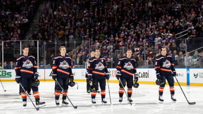
The New York Islanders brought back their long-lost logo when they debuted their latest Reverse Retro jerseys against the Carolina Hurricanes at UBS Arena on Saturday.
The Fisherman crest was part of an Islanders uniform redesign that was unveiled for the 1995-96 season. But after player and fan vitriol, it was mothballed after two seasons. Saturday was the first time the logo was worn in a game since April 12, 1997.
"It's awesome. I think they look great," forward Zach Parise said of the new/old logo. "You've seen a lot of fans at our games wearing them too. I think they look so good. It's going to be really cool."
The jerseys went on sale Nov. 15, and forward Brock Nelson said he immediately placed an order.
"I'm excited," he said. "I got a couple for the kids right away when I saw them."
That's a slightly different reaction than from those who wore the logo during its original run.
When told by reporters that the Fisherman logo was being put out to sea in 1997, then-Islanders defenseman Darius Kasparaitis couldn't hide his feelings.
"Good," he said. "We looked like idiots."
\\*
The Islanders logo featured a map of Long Island as their jersey crest from the franchise's inception in 1972 through four Stanley Cup championships from 1980-83 and beyond.
But by the middle of the 1990s, the stars of the dynasty teams had retired or moved on, and the Islanders began to falter. The New York Rangers won the Cup in 1994, sweeping the Islanders in the first round of the Stanley Cup Playoffs that season. The New Jersey Devils won the Cup the following season. In that same season, the Islanders finished 25th of 26 teams in the NHL standings.
Islanders management felt change was needed to keep pace in the crowded New York sports marketplace.
© Denis Brodeur/Getty Images
"There was this thinking that fans were starting to associate the original Islanders logo with the failure of the past two seasons rather than the dynasty greatness," said Nick Hirshon, the author of "We Want Fish Sticks: The Bizarre and Infamous Rebranding of the New York Islanders." "Maybe some idea of getting a new product out there that would get you some money on the market, get some new jersey sales going and maybe that money could be funneled into improving the team and the arena.
"Also, which I really think is a big part of this, all of the young players of the 1990s were being compared to the dynasty players. So any new young forward who comes up is going to be the next Bob Nystrom or Clark Gillies or Bryan Trottier. Any new defenseman is the next [Denis] Potvin. The goalie is the next Billy Smith. After a while that wears on the young guys and messes with their psyche. And so you give them their own identity and say we had this period with the original logo, but we have some young players who we are excited about, we have some high draft picks and let's give them something that can be their own."
Though the idea might have been a sound one, the finished product missed its moorings.
The Islanders contracted SME, a sports marketing and design firm, to create a new logo that would better personify what it meant to be from Long Island.
"At one point they considered a dinosaur as native to Long Island, but dinosaurs were native to everywhere," Hirshon said. "All sorts of sea creatures, crabs, lobsters. Eventually they start thinking about someone who is kind of like a fisherman."
How the logo could be publicized also was important, and in the mid-90s there was no more prominent place to get your brand than on a video on MTV.
And one of the most well-known musicians of that era happened to be Long Island native Billy Joel.
"They end up looking at this song, '[The] Downeaster "Alexa",' which came out in the late 1980s," Hirshon said. "In the music video for the song there's a bunch of grizzled baymen, older guys, so they settled on this image. It's a strong image of the enduring spirit of Long Island and we can pay tribute to these figures whose way of life is being threatened right now and maybe we can possibly get Billy Joel to latch onto this and come to some games and help make the jersey more popular.
"I think there was some wisdom in parts of that idea."
"The Downeaster 'Alexa'" was on Joel's "Storm Front" album, released in 1989. By 1995, the song had long since left the Billboard charts.
"It's like, let's do 'Gangnam Style' on our jersey now," Hirshon said. "That ship has sailed."
But the image of the grizzled bayman was chosen, with the bearded mariner wearing a rain slicker and hat, gripping a hockey stick. The jersey also featured a new color palette that included swirling shades of blue, teal and orange meant to resemble a wave in the ocean.
The Islanders were going to unveil the new look for the 1995-96 season, but a rogue wave in the form of a budding reporter and the New York Daily News capsized those plans.
Colin Stephenson broke the news about the logo change in a story published in the New York tabloid April 20, 1995. Along with the article was a picture of Potvin with the new logo photoshopped on his jersey, accompanied by the headline, "Isles' new logo would be sea sick."
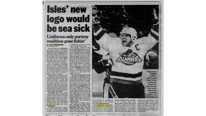
In a recent interview with NHL.com, Stephenson was reluctant to name his source. But the source revealed himself in recent years.
Peter Schwartz, currently an update anchor on WFAN sports radio in New York, was the budding reporter at the time. In a blog post in 2018, he wrote that he was shown the logo while visiting a Gerry Cosby sporting goods store on Long Island. Because this was before smartphones, he made several photocopies of the logo and took them to the Islanders game either that night or the next night. He showed a bunch of reporters the logo, but only Stephenson was interested.
"Those of us that were covering the team and the people around the team knew that this was coming and we knew it wasn't going to be popular, just based on what we were hearing," said Stephenson, who covers the Rangers for Newsday.
Stephenson showed his editors at the Daily News, and they jumped on it.
Chris Botta, who worked in public relations for the Islanders at the time, said more than 25 years later he still remembers where he was when he learned the logo had been leaked.
"I was in a hallway in Philadelphia before a game when that broke," he said. "It was one of those things where internally ... it felt like it was DOA before it even got out there. Because what a horrible image, to put that on Denis Potvin. The Daily News knew what they were doing. That's business, that's newspapers, that's media, I respect that. But people saw that and were horrified, and we understood that."
The Islanders officially unveiled the jerseys at a press conference June 22, 1995.
"I personally didn't like it," said Bryan McCabe, a defenseman who made his NHL debut with the Islanders in 1995-96. "Being drafted by the team (in 1993) and obviously the tradition, four Cups, the winning history, I was really looking forward to wearing that original jersey. And by the time I made the team it was gone. I was disappointed."
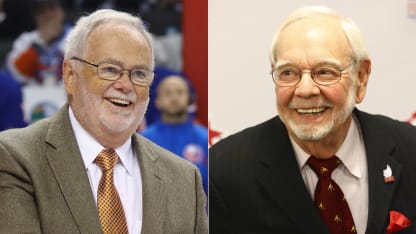
Disappointed might have been one of the nicer things said about the new look. Some thought the Fisherman resembled Islanders play-by-play announcer Jiggs McDonald; others said it looked like longtime NHL broadcaster Stan Fischler.
© Getty Images
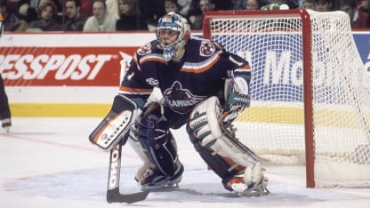
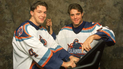
And there was the striking resemblance to the Gorton's fisherman from brand of frozen seafood. That led to derisive chants of "We want fish sticks" during Islanders games.
"[Heck] yeah we heard it," McCabe said. "You couldn't not hear it when 17,000 Rangers fans are cheering it. It's not like it got under our skin or you couldn't play hockey, hearing them chant, 'We want fish sticks.' But it was kind of embarrassing, I would say that."
© B Bennett/Getty Images
As the new marketing ship began taking on water, Islanders management announced the team would return to wearing the original logo for a select number of games in 1996-97, while keeping the new color scheme, and discontinue the new look entirely after that season.
Though the reaction to the logo was incredibly negative, it might have had more to do with the Islanders' rapid descent in the standings. They finished last in the Atlantic Division three straight seasons from 1994-97.
"The real reason for the vitriol is that the team stunk, and basically this logo was I think intended to sort of distract people from how the product on the ice wasn't very good," Stephenson said. "It was like, 'Hey, look at this neat little logo that we just came up with and this new uniform design,' and what people wanted was a better team, and the team was bad. And so that really was what they were upset about more so than having Stan Fischler on their on their shirts."
\\*
The Islanders' fortunes didn't change once the old logo came back; they didn't return to the playoffs until 2002 and didn't win a playoff series until 2016.
Along the way, there would be rare sightings of the Fisherman, including on warmup jerseys before a game on Feb. 3, 2015, as part of the Islanders' final season at Nassau Coliseum before they moved to Barclays Center in Brooklyn.
But it wasn't until the reveal of the NHL Reverse Retro jerseys for this season that the Fisherman triumphantly docked on the beaches of Long Island.
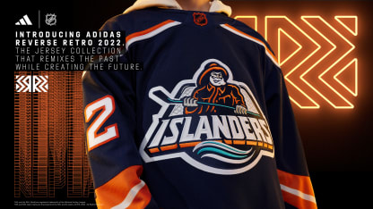
"I think the Islanders current ownership has done a nice job kind of balancing and embracing some of the Fisherman because there's certainly demand," NHL chief branding officer Brian Jennings said. "If you look at any poll that gets done, it's one of the jerseys that a lot of the fans say, 'I would love for that to make a comeback,' or to at least come back as the iteration of what the Islanders used for their Reverse Retro.
"So you can have some fun and [the Reverse Retro program] gives you permission to do that. I'm excited for Islanders fans and excited for the team being able to wear it."
McCabe would vouch for that poll. He is director of player personnel for the Florida Panthers, but his wife is from Long Island, and the family spends part of the offseason there.
"I took my son to an Islanders playoff game a couple of years ago when they had their run (to the 2021 Stanley Cup Semifinals)," he said. "And I'm like, 'I'll get you an Islanders hat, although it's blasphemy for me because I work for the Panthers.' But he's a Long Island kid, he was born there, and he picked out the Fisherman hat. That's the one he wanted."
Stephenson had a similar experience with his son.
"My oldest son is an Islanders fan, so I have a window into how Islanders fans think in my own house," he said. "And he loves the Fisherman logo, and according to him, all the fans on social media love it. And I remember going to a game in Brooklyn in the 2017-18 season, probably around Christmastime, and they had a Fisherman jersey giveaway. People got those jerseys and people loved it."
The current Islanders players share that enthusiasm.
"It's nice to wear something different," forward Matt Martin said. "It's a logo that's been around for a while in our team store, and I've always wondered if we're going to throw it on. I like the little bit of teal in there as well. I think guys are excited to wear it."
