Kachina_story_2568x1444

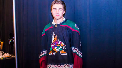
GLENDALE -The Coyotes announced Monday the team would wear its original black Kachina jerseys for 14 home games in 2018-19, including all 13 Saturday games to be played at Gila River Arena.
The sweaters were officially declared the team's third jersey earlier this off-season.

The Coyotes first donned the innovative tops in 1996-97 after relocating from Winnipeg to Phoenix, and continued to wear them until the 2003-04 season.

03051998tocchet

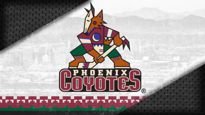
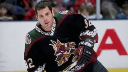
The original logo, created by the Phoenix-based graphic design firm Campbell Fisher Ditko, was unlike any NHL logo in its concept and its intricacies. It depicted a Kachina-style coyote standing upright with a hockey stick; the most striking feature was the mask drawn in Southwestern style to show off the team's new colors: forest green, brick red, sand, sienna and purple.
"It was an exciting design but it was certainly not a traditional hockey presentation," David Haney, who served as Creative Director for the NHL at the time, said in 2015, when the team first brought back the jersey for a well-received Throwback Night at Gila River Arena. "It was hockey as interpreted with a Southwest feeling and the result was most intriguing. All of those different elements within that interpretation of the coyote on the skates with the stick were just fascinating to look at. It was a very complex logo, which was a good thing because it was giving you the opportunity to see something new every time you looked at it. Perhaps that's why fans who fondly recall the logo gravitated to it. It was very engaging."
tkachukinjersey

Greg Fisher, who designed the logo, agreed.
"There's a lot going on in that logo and I think it accomplished what they were hoping it would accomplish, and that is to give the fan base some visual cues that make them know this is an Arizona team right away," Fisher said in 2015. "It was very complicated. For instance, most people don't realize that the words 'Phoenix Coyotes' are enclosed in a hockey puck on its side. The real hockey fan is going to pick up on that, but not everyone will."
Fisher said he was asked to stay away from designing a logo that featured an angry animal and to focus on a hockey-meets-the-southwest theme. He also remembers lots of give and take between his firm, the team's owners at the time and the NHL regarding details such as the color palettes and type fonts within the logo.
Fisher was pleased when the Coyotes decided to dust off and celebrate the team's original logo in 2015.

kellerjersey

"I really enjoyed being involved with that project," Fisher said. "It was fun to be part of the inner circle of the Coyotes as they were getting ready to launch. It was very exciting at that time and we were having a lot of fun."
He added, "Nostalgia is great. I think Throwback Nights across all the leagues are awesome. It gives fans an opportunity to touch base with the history of the franchise. That logo will forever be part of the Coyotes legacy."
EDITOR'S NOTE: Portions of this story first appeared in a story written for this web site by the same author on Feb. 27, 2015.