The Lightning are set to host their sixth annual Pride Night at AMALIE Arena Thursday night, with the NHL’s “You Can Play” initiative leading a slate of events celebrating the inclusion of everyone in the sport.
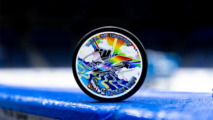
At the center of the Lightning’s numerous promotions and proceeds toward the Tampa Bay LGBTQ+ community—including a pregame performance from Tampa’s own Shevonne & The Force—is the night’s prized mystery puck helmed by artist Macy Higgins.
Higgins is a hometown maven of local art with featured works at museums throughout St. Pete. And its abstract layering of color and design makes for the Lightning Local Artist Program’s most striking puck yet.
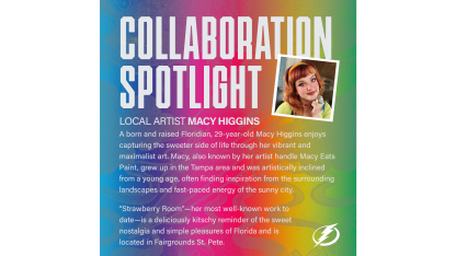
In a new local artist spotlight, Higgins dives into the vision behind the puck design, creative expression and activism, and the tangible joy that radiates through the Tampa Bay area.
Who is Macy Higgins and how did you get here?
My name is Macy Higgins, but also commonly referred to as Macy Eats Paint, which is the handle I’ve been using for my art for nearly a decade. I am a born-and-raised Floridian. My family moved to the Tampa area when I was a toddler, so I’ve had the classic Tampian experience growing up. I’ve been active in the art community since 2016 but put my art on pause last year so I could relocate my home and studio to St. Petersburg. Now that I’ve settled in, I’m so excited to dive back into more involved projects like the Pride puck.
How did you come up with the idea for the puck design?
When I was contacted about designing the Pride puck, I was immediately inspired by the two seemingly opposing weather symbols that represent the team and the queer community. LGBTQ+ uses the rainbow as our symbol for pride and unity. Rainbows are soft and diffused, a spectrum of color. Whereas the Lightning use the lightning bolt as their symbol of pride and unity. Lightning is strong, fierce, and illuminating. When combined, they’re a spectacle of color and light, much like the Pride Night game.
What went into the creative process?
As far as the process, I did a quick sketch on a piece of paper, photographed the sketch, then used the sketch as a starter template for my digital drawing. I went through about four revisions of the same design before sending it off for review, then I did several more detailed revisions with the guidance of the Lightning Foundation. It was an exciting task to fit all the elements that I wanted into the design, but I love how much Tampa and pride really shines through in the end result.
