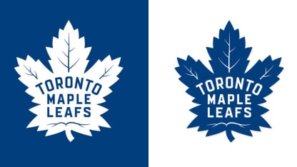
"When I came here I asked the question why it ever changed," Shanahan, in his second season as Maple Leafs president and alternate governor, said Wednesday. "I always loved the look of the original maple leaf and I wanted to know why it ever changed. It seemed most popular with our fans. Our players loved whenever they had the opportunity to wear what they called a throwback type of sweater with the logo.
"What we're trying to build here and the history we want to emulate is one that we identify more with that logo than the current one. I asked a lot of questions about why we ended up changing it and didn't get a lot of really good answers. So it seemed more and more like the people in Toronto and the people in our organization wanted to go back to what Conn Smythe had in mind when he first said, 'We're going to be the Maple Leafs.'"
The leaf on the new logo features 31 points, a tribute to 1931 when the Maple Leafs' former home, Maple Leaf Gardens, opened. It also has 17 veins, representing the Maple Leafs' founding in 1917, and 13 veins at the top, honoring the 13 Stanley Cups the Maple Leafs have won.
Shanahan said he is pleased with the feedback he has received so far.
Maple Leafs reveal new logo
"Just looking at the ever-reliable Twitter, so far so good," Shanahan said. "I got a lot of e-mails [Tuesday and Wednesday] from friends, from alumni, from people that work with us, and from what I see out there I think people appreciate why we did what we did and also what we came up with as our logo going forward."
The Maple Leafs logo has been altered occasionally since it was introduced in 1928. The first jersey featured a 47-point Maple Leaf crest on the chest with the words "Toronto Maple Leafs" inside it. In 1934 veins were added to the Maple Leaf and in 1937 the words "Toronto Maple Leafs" were turned downward.
In 1942 the number of points on the crest was reduced to 35, and in 1947 the words "Toronto Maple Leafs" were switched to red for one season.
In 1967, just before the Stanley Cup Playoffs, the Maple Leafs went with a new logo that featured an 11-point leaf, and the downward slope of the word Toronto was reduced marginally. In 1970 they made the word Toronto run straight across the crest. In 1987 the crest was changed to a darker shade of blue.
"Obviously I like it a lot," Shanahan said of the new look. "It was a real collaborative thing with everyone involved. It was something we were thinking about last year. It was a real process with the NHL and with Rebook to make a change like this. We talked to our players, we talked to our alumni, we talked to some of our own historians that really know the details of how we came to be the Toronto Maple Leafs. I am very pleased with what we have come up with. And it is just one piece of what we are trying to do here. Ultimately what is most important is what the players do while they are wearing the sweater.
"This is just one little piece. We are trying to take care of all the details that we think are important to us, and I thought it was important that we got back to the story of why we became the Maple Leafs. There are some subtle changes to the logo. But for those that thought we were going to look for some radical changes, we weren't.
"We've got too much respect for our history and for the people that built this organization; guys like Teeder Kennedy, Syl Apps and George Armstrong. We thought that era, our first real dynasty, was sort of the inspiration for what we want to do with the logo going forward."


