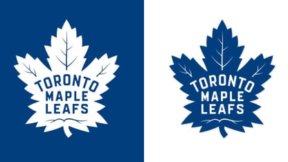
"As an organization, we wanted to get back to our roots, when Conn Smythe first changed the team logo to the Maple Leaf in 1927," team president Brendan Shanahan said in a statement. "Inspired by the badge that he and his fellow Canadian soldiers wore during World War I, Smythe wanted his team to wear the badge with 'honor, pride and courage.' That is our goal for the next chapter in Leafs history. We are committed to restoring the Toronto Maple Leafs to a proud and prominent place and this classic logo will connect the team's championship legacy with an exciting and proud future for our players, our city and for our fans."
The new Maple Leaf has 31 points, a tribute to the year 1931, when Maple Leaf Gardens opened. It contains 17 veins, representing the year the franchise was founded (1917), and includes 13 veins at the top of the crest to commemorate the club's 13 Stanley Cup championships.
The outline, seen in the most recent version of this Maple Leaf from 1963-67, has been removed to create a cleaner, bolder look.
The Maple Leafs will unveil the team's new uniforms incorporating the logo at the 2016 NHL Draft, scheduled to be held June 24-25 in Buffalo.
Shanahan recently gave his players the first opportunity to see the logo.
"I wanted to talk to you guys about next year," Shanahan told the players. "It's about us rebranding the Maple Leaf and I wanted to bring it to you guys first. You guys are going to be on the front line. You are the guys wearing it. … We didn't hire a marketing firm; we talked with hockey people and we went back to what we think is the very first Leafs dynasty. It only makes sense to go back to what the Maple Leaf was originally intended."
Center Nazem Kadri admitted he was a little wary about the logo change when he first heard about it, but said he likes the end result.
"Toronto has a rich history and the logo means a lot to Leafs fans and the players and the organization, but after I see it I loved it ever since," Kadri said. "I think everyone else is going to like it. I think it's a bit of an old-school look, but I think it's a look that works."
Kadri believes the organization hit the right note in its attempt to combine the past and the future.
"It's different," Kadri said. "Obviously it's traditional and you don't want to change it too much. I don't think they have really tweaked it too much, but it's all about tradition in the Maple Leafs organization and it's a new look for us, but they are bringing the past into the present and I like it."
The logo has been altered occasionally over the years since it was first introduced in 1928. Toronto's first jersey featured a 47-point Maple Leaf crest on the chest with the words "Toronto Maple Leafs" inside the crest. Veins were added to the Maple Leaf in 1934; three years later, the words "Toronto Maple Leafs' were turned downward.
In 1942 the number of points on the crest was reduced to 35. In 1947 "Toronto Maple Leafs" was switched to red for one year.
In 1967, just before the Stanley Cup Playoffs, the Maple Leafs went with a new logo that featured 11 points, and the downward slope of the word "Toronto" was marginally reduced. In 1970 the word "Toronto" was run straight across the crest. In 1987 the crest was made a darker shade of blue.


