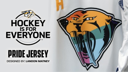
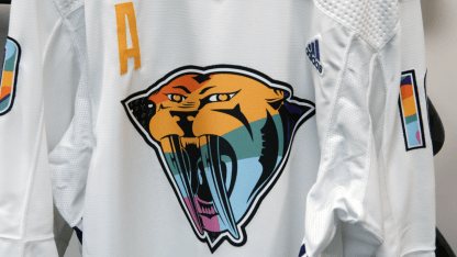
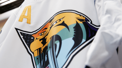
Matney also chose the Mustard Cat because of a very significant shape outlining the logo's roaring sabertooth tiger.
At one point used as a badge to identify and shame gay and lesbian prisoners of Nazi concentration camps, the upside down triangle has since been reclaimed by the LGBT community and repurposed to represent self-identity and love.
"They had gay men wear upside down pink triangles and gay women wear upside down black triangles," Matney said. "Later in the 70s and 80s, it was used as an act of protest. And I think that's sort of telling to the gay community and the LGBT community in general. It's kind of taking the backlash and reversing it."
While Preds Gold is still featured heavily in the design, the original Mustard Cat colors have been replaced by swaths of coloring from both the traditional Pride flag - orange, green and violet - and the transgender flag - light blue and light pink.
"I didn't want to go with too basic of an option," Matney said. "I ran with the Gold, obviously as the primary color of the Predators. I knew the jersey was going to be white and black, so the outline of everything is black. And I wanted the transgender colors to be apparent, because there are a lot of rights issues around that community right now. So that's apparent in the color and in the pattern. But otherwise, it was my goal to have kind of a uniqueness to them."
Consider the goal accomplished.
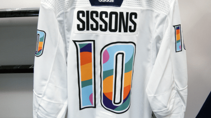
Contributing to the jersey's unique look are the colorful swirling patterns within each number, no two of which contain an identical fill.
