GETTY_editorial_lead_image

For the 2017-18 season, adidas will become the NHL's official jersey manufacturer, and with this change every team was given the opportunity to redesign its uniform.
This, unsurprisingly, lead to a year of speculation, anticipation and even a bit of panic for some fans. While we don't know yet what's in store for each team, we do know this: Some clubs' jerseys will stay the same, others will change and a small group of fans from each team will be very vocal about the results no matter what.
It's important to remember, though, that progress isn't made while standing still. Before we can see where we're headed, we should first look back and see who we've been.
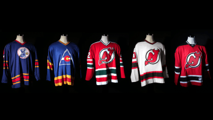
This is the evolution of the New Jersey Devils' jersey.

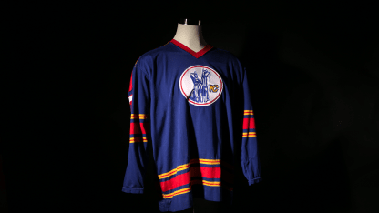
Kansas City Scouts, 1974-1976

kansascity

While few Devils fans' memories go back this far, the design choices made in the '70s can still be felt in our club today. For two years, the Scouts (the NHL club that eventually became the Devils) donned a bold sweater that included brightly colored stripes. The establishment of red in the team's history began with a three-stripe pattern across the elbows and waist. The modern, clean collar with single color was another feature that helped the team stand out. The Scouts only wore these jerseys for two years, before relocating to Colorado and rebranding.

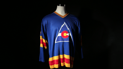
Colorado Rockies, 1976-1982

colorado

Paying homage to the Kansas City Scouts, the Colorado Rockies were born wearing the same bold colors as their former team with a few key changes. The new look came by way of addition by subtraction - removing the stripes from the shoulder and sleeves, eliminating the thin lines within the golden stripes, and establishing a more modern equally weighted three-stripe system. The end result created a uniform that would later evolve into the Devils' current uniform with a few slight adjustments. But this franchise was destined for New Jersey - and a new jersey.

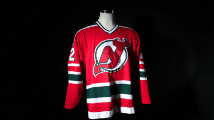
New Jersey Devils, 1982- 1992

retro

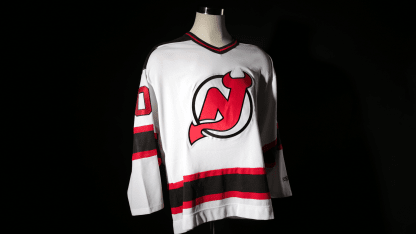
With the birth of the New Jersey Devils came the first jersey in Devils history. Now fondly known only as our "retros," then the team's new identity was a stark departure from the past. The two-stripe design was the first time in the club's history that they had departed from their traditional three. Second, the striping on the shoulders harkened back to the Scouts, but with a more '80s twist. And lastly, the team found new colors to match their new home. For 10 years, New Jersey established tradition in this jersey, but history would be written in a new sweater.

New Jersey Devils, 1992 - 2007

whitejersey

In 1992 the Devils got a facelift. During the era these jerseys were worn, the team won three Stanley Cups and established themselves as a winning franchise. This new jersey featured a simplified all-black shoulder (which Scott Stevens made known to many an opponent), and went back to a three-stripe system that featured a smaller outer stripe. The result was an instant classic - a jersey that felt both modern and classic. A jersey that all NHL fans would say is one of the best in the league.

New Jersey Devils, 2007-Current

redjersey

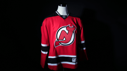
In 2007 the RBK Edge or "Edge" jersey was introduced to the NHL. With this switch, the Devils updated their jersey with a single small change. The black shoulder was pulled back to create a color-blocked area that sat more neatly across the players' uniforms. It was a minor adjustment, but made for a more modern and athletic look.
We know what you're wondering: Where do we go from here. What's next? What will the future look like for the franchise as Adidas is set to unveil the new New Jersey jersey on June 20?
While we can't say what it will look like yet, we can say, once again, progress doesn't stand still. We should always remember our past, as we set our eyes on the future.