mangiapane split

It's a bad drawing for a good cause.
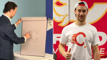
Everyone had a good laugh at Calgary Flames forward Andrew Mangiapane's artistic interpretation of the team's logo a few weeks ago during the NHL media tour in Toronto.

In terms of accurately representing what the Flames logo looked like, it was -- how can we say this nicely -- inaccurate. The "C" was asymmetrical and thin and the flames coming off the back were far too few and rounded. Here, have a look:

But Mangiapane clearly did his best, and that has resonated with teammates and fans alike.
The work of "art" has been updated with color and put on a T-shirt available for sale at the Flames team shop.

Best of all, the proceeds will go to the Hotchkiss Brain Institute at the University of Calgary, which works toward "innovative solutions for neurological and mental health disorders."

Mangiapane addressed the shirt with the media on Friday.

"I think they kind of like it. I think guys are making fun of me, but I think they're just jealous," Mangiapane joked.
"Everybody wants a T-shirt," said defenseman Erik Gudbranson.
"It wasn't the best drawing, but hopefully I'll work on those skills a little later," Mangiapane said.