The New York Rangers franchise has been in existence for nearly a century. In that time, the Blueshirts have rarely strayed from their iconic jersey design and crest.
For almost all of their history, the team's jersey has featured the "Rangers" letters diagonally down the front, and the team's crest has featured "New York across the top with "Rangers" stretching diagonally from top left to bottom right.
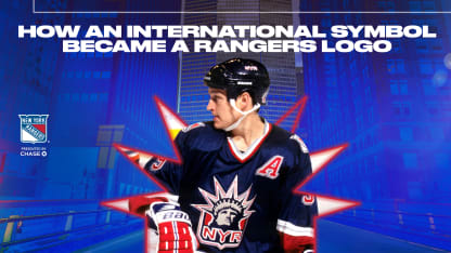
Prior to the 1996-97 season, however, the Rangers decided to add a third jersey to their rotation for the first time in franchise history, as well as a new logo. This jersey and logo combination, based off the Statue of Liberty, has become revered among Rangers fans.
Lady Liberty - How an International Symbol Became a Rangers Logo
Rangers Bring Back Iconic Liberty Logo and Jersey for 2022-23 Season
By
Michael Rappaport
The Rangers wore Liberty jersey from the 1996-97 season through the 2006-07 season and brought back the Liberty jersey as part of the NHL's Reverse Retro alternate jerseys in 2020-21. The Liberty jersey will return again for the 2022-23 season, as the NHL launches its Reverse Retro 2022 jerseys initiative.
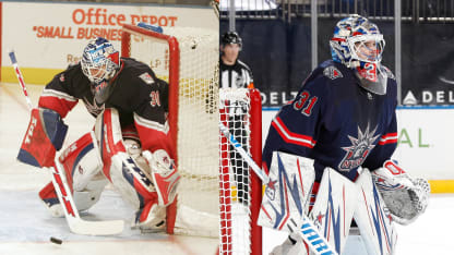
Given how well-received the Liberty jersey was by Rangers fans when they were officially unveiled in January of 1997, it might seem that it was a no-brainer for the Rangers to select that design for their third jersey. However, there were several concepts and designs that were considered when the Rangers decided to have a third jersey.
Neil Smith, who was the Rangers' President and General Manager at the time, was fond of the franchise's history and connection to New York. For example, it was Smith's idea to add laces into the neckline of the Rangers' jerseys in the late 1990s, bringing back the look of the team's jerseys for the majority of the 1960s and through the mid-1970s.
As teams began to add third jerseys throughout the 1990s, Smith wanted the Rangers to have one as well. The theme was simple, as Smith recalled in the press conference when the jerseys were unveiled - "we really wanted to pull in a New York City identity. What we tried to come up with was the number one identity for New York City."
Smith, along with the Rangers' public relations department and marketing department, worked alongside Ed O'Hara from SME Branding, a New York branding agency, to come up with the design. Several New York options were discussed and considered, including King Kong on the Empire State Building.
Along with discussing options for how to best represent New York, there was a discussion about what to do with the Rangers crest. O'Hara and SME Branding wanted to modernize the traditional Rangers crest and alter the design. This "modernized" logo ultimately became the patch that was added to both shoulders of the jersey. However, because it appeared to be too similar to the Rangers' traditional crest, there was hesitation about featuring that design front and center on the jersey.
One idea that appealed to Smith was the Statue of Liberty, based on the design that Mike Richter had on his mask. It ultimately came down to two options - either the Statue of Liberty logo as the patch with the "modernized" logo as the jersey crest, or the Statue of Liberty logo as the jersey crest with the "modernized" logo as the jersey patch.
The combination of the Statue of Liberty image, along with the "NYR" letters underneath, proved to be the winner.
Besides the logo, Smith felt the NYR identification was important; at the jersey unveiling, he said, "We've always been identified by those letters. I think we're the only team that has initials that are instantly recognized."
"I remember when I saw them for the first time that I thought they were very cool, to coin a phrase," said Adam Graves, who was one of three Rangers who took part in the jersey unveiling ceremony with Mark Messier and Luc Robitaille. "For me, the jersey was so New York with the Statue of Liberty."
"We loved it when the jerseys came out," Richter said. "There weren't many teams that had third jerseys at that point in time. Given that we're an Original Six team and have the great history that we do, the traditional logo works. If you're deviating from that, you're thinking 'what works in its place that has the same impact and powerful statement?'
"I love the Rangers jersey, both home and away. The blue jersey in particular - I was so proud to wear it. You're the Blueshirts, and when you put that on, you don't need to say much more than that. With a third jersey, you don't want to diminish what you already have, and this one didn't diminish it at all. This was so original, so well done, and so thought out.
"When you put the Liberty jersey on, you were proud to put it on."
The Rangers would wear the Liberty jerseys for nine more seasons after 1996-97 - including a switch to a White Liberty jersey instead of the original navy blue base for 1998-99 - and during that time, the jersey and logo helped identify the Rangers for a whole generation of fans. After bringing the Liberty jersey back for six games in 2020-21, fans and players alike are ecstatic about the jersey returning this season.
"That's the great privilege of being a Ranger, playing on Garden ice, and wearing our traditional jerseys and, of course, having the opportunity to wear the Statue of Liberty jersey," Graves said. "When I look at the current team and the character of that group, it makes me proud to say that I wore the same jersey that they so proudly wear now.
"And, like a lot of other fans, this means I will be going by the team store and will be grabbing Liberty jerseys for my family around the holidays."


